.jpg)
Search “Web Design Tips” on Google and you’ll get bombarded with hundreds of articles about anything from SEO tips to heated debates on above-the-fold content. If you don’t take a step back from it all, you’re bound to get overwhelmed.
When it comes to your website, just focusing on a few major components can make the design process much more straightforward. Try not to get too bogged down in things like animation or other “nifty” web design trends—oftentimes those are reserved for a particular type of site, such as e-commerce, agencies, or entertainment. The components we’d like to cover today include typography, color, imagery, and layout. So, let’s get started.
1. Establish Hierarchy with Text
If you think about it, your website is really just a bunch of words with images. As such, focusing on readability should be of utmost importance when designing your website. One of the best ways to achieve readability is establishing hierarchy with text styles.
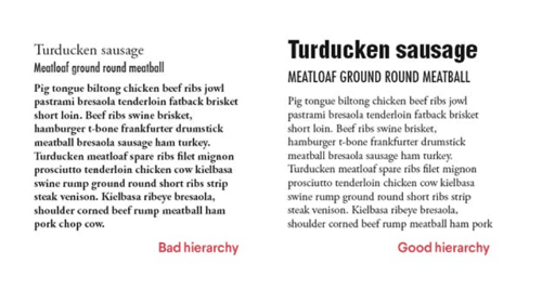
Take a look at the following comparison:
 Credit: 99designs, “14 typography crimes to stop committing”
What makes the example on the right “good” (other than making us extremely hungry)? Whether or not you realize it, your eye is immediately drawn to “Turducken sausage,” followed by “Meatloaf ground round meatball,” then the body text underneath—just the order the author intended you to follow. The example on the left, however, doesn’t provide enough contrast between title, subtitle, and body text. The reader might get confused about what he’s reading, which is problematic.
How to establish hierarchy with text:
- Increase the font size of headers/headlines and opt for a bold font weight/typeface. Your goal is to distinguish it from the rest of the text.
- If you use subheaders/subtitles, distinguish it from the header by using a smaller font size (but bigger than the body text). Oftentimes subheaders are also italicized to create more contrast from the header.
- Body text should be close to the last rung in the hierarchy size-wise, but nonetheless just as important readability-wise. Keep this text style consistent and ensure the spacing between lines is large enough.
2. Pick two or three colors and stick to them
While it may be tempting to use every color in the rainbow on your website, it’s good practice to choose two to three colors and use varying shades of those colors to create contrast.
You most likely already associate certain colors with your brand. This is the perfect starting point. We’ll help you effectively apply those colors to your website by taking a look at a couple examples.
Here’s a color palette based off of two colors:
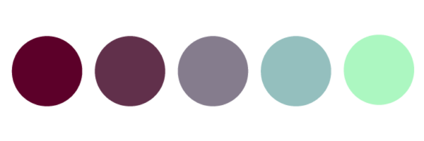
This palette is a good example because it only focuses on two colors and features different shades of those colors. Additionally, purple and green contrast well together—for example, if you used a darker purple as a background with the bright green for the call-to-action buttons, viewers would instantly notice the call-to-action.
Here’s a color palette based off of three colors:
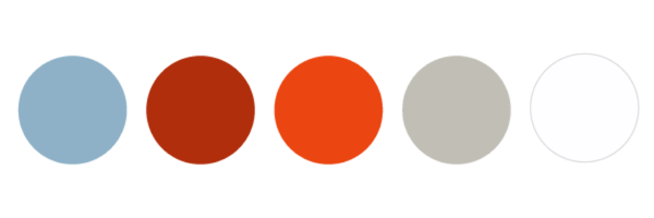
Once again, we see the oranges contrast nicely with the blue while the greys provide a nice, neutral balance. If you decide to use three colors, including neutral tones in addition to two bold colors makes the viewing experience easier on the eye.
3. Give it space
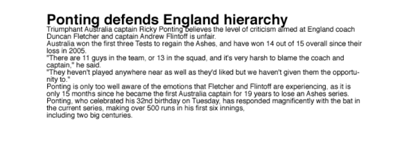
You might be surprised how seemingly complex design problems on your website can be fixed with a little spacing adjustment. Many times, spacing issues arise in text. Revisiting Tip #1 (establish hierarchy with text), proper spacing optimizes readability. Text that is too cramped or too far apart makes it difficult for readers to follow. Take a look at the following example.
 Credit: A List Apart, Whitespace
Icky.
The golden ratio in the web design industry, while often debated, normally falls around 1.4 (example: 15pt (font size) * 1.4 = 21px (line height)). Definitely use your best judgment here, as it relies on your body text size.
Spacing is also important around elements other than text, such as images, buttons, and menus. Text should never touch images, and buttons should be far enough away from text so they stand out. At the end of the day, trust your eye!
4. Keep your navigation menu simple
You may be tempted to include every page on your site in your primary navigation menu (often at the top of the page), but this is not always the best decision. People get overwhelmed when they are presented with too many options; they might even leave your website if they can’t find what they’re looking for easily.
Providing fewer navigation items increases the likelihood that site visitors will come across information you want them to see (ultimately increasing conversions through your site!). For example, if your goal is more contact form submissions, eliminate the road blocks to get to the contact form itself.

Credit: byalicelee.com
In the example above, there are only four menu options. If a visitor wanted to contact this person, she would have no issue figuring out how. This should be your goal for your website, too!
5. Experiment with a hero image and bold header text on your home page
Many sites on the web feature a similar format on their home page. Does this look familiar?

Credit: mint.com
This is called a hero image, and it’s been all the rage in web design trends for the past couple of years. And web designers say it’s not going away any time soon! Hero images span the entire width of the page and are often full height (i.e. it takes up the full screen when you load the page).
Hero images are usually paired with large, bold header text that immediately grabs the viewer’s attention (similar to the example above). This is a simple but effective way to get your website’s message across right when visitors come to your site. Including a call-to-action button (again, like the example above) is also good practice—it provides users with a direction for your site and optimizes conversions.
Make sure to use a high quality photo if you choose to experiment with hero images. Because it takes up such a large portion of the page, it is important that the image is not pixelated at all. There are plenty of free stock image sites available—this article is a good starting point.
---
Whether you’re building your own website or hiring a freelance web developer to help you out, we hope you find these tips useful when tackling your website’s design!


